Un nuovo studio ha mappato la dipendenza dall’auto in 18 città. Spiccano due città europee.
https://i.redd.it/7bkugfnpzqxg1.png
di NLegendOne

Un nuovo studio ha mappato la dipendenza dall’auto in 18 città. Spiccano due città europee.
https://i.redd.it/7bkugfnpzqxg1.png
di NLegendOne
26 commenti
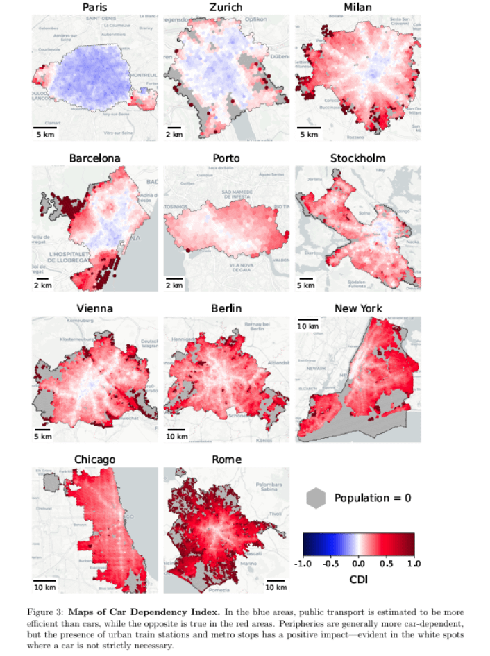
Source: “Car Dependency in Urban Accessibility” – [https://arxiv.org/abs/2604.01019](https://arxiv.org/abs/2604.01019)
Very interesting new study finding that even in large European cities, in most places it is easier to access opportunities by car than by public transport.
The exceptions are Paris, Zurich and the innermost parts of Milan and Barcelona.
The study introduces a Car Dependency Index (CDI) computed from access to essential services and leisure activities. Red areas = car is more efficient; blue areas = public transport is. Out of 18 cities (Europe + North America), only Paris and Zurich come out net-blue at the city level. And the authors note both have relatively small administrative boundaries, which flatters the comparison.
Inner Milan and Barcelona also have blue cores, but their peripheries flip red quickly. Rome, Vienna, Berlin, Stockholm, Porto and the US cities are mostly red across the board, with white spots clustered around metro and urban rail stations.
From the paper:
1 Paris (Municipality) -0.111
2 Zurich -0.020
3 Nantes 0.013
4 Bordeaux 0.053
5 Milan 0.063
6 Barcelona 0.087
7 Porto 0.091
8 Stockholm 0.094
9 Munich 0.102
10 Valencia 0.102
11 Vienna 0.129
12 Paris (OECD City) 0.166
13 Seattle 0.188
14 Berlin 0.195
15 Karlsruhe 0.202
16 New York 0.241
17 Chicago 0.270
18 M´alaga 0.310
19 Rome 0.335
I am upset there is no cities from the bike paradise, the Netherlands.
Paris is biased, as it’s only the city and not the urban area.
To make a simple comparison, it’s like reducing New York to Manhattan
If you want to get into, out of, or around Manhattan, public transit in NYC is the way to go. Literally anything else is an hour plus of circuitous traveling.
So are these phantom borders for the subway systems?
My empirical tourist experience – you get by just fine with walking + public transport in all the European cities in this diagram and New York. In some of them finding parking near where you’re supposed to be can be quite time consuming, not to mention expensive.
Rome is an absolute nightmare of cars IMO. It’s one of my favourite cities aside from the car obsession, but it’s so ruined by the way that you cant walk anywhere without having to jump out the way of cars driving really fast down tiny alleyways. So much of it would be amazing if it was more accesible by bike/pedestrianised/had better public transport
No Amsterdam? No Utrecht?
A shame London isn’t featured. I would like to see how West London is massively more car dependant than the East.
Not sure how its measured but i live in a “red area” and the public transport is quite alright near me
Maybe its cause there is only one metro and one bus line near me that the score is low. But since both their itineraries go to the city center (where most transport converges) quite fast you can be in a lot of (busy/important) places around the urban area in around 30 minutes or less
“Car Dependency Index” is kind of misleading. In most red areas in the shown cities you do NOT need a car, thus you are not dependent on using one to actually live a good life (with some exceptions). Only because the car might be a little bit faster in many cases does not make it necessarily “better” and it definetly does not make someone being dependent on owning a car. Also, the map does not show one of the most important factors that make many European cities so livable: pedestrian and bike infrastructure.
Probably was just the area I was in but the subway and trams in Rome were surprisingly easy to navigate. Made it out to a Roma match quite easily too in multiple different kinds of public transport
Youre telling me Milan has better public transport than Vienna?
The way this graph tries to make the implication that blue = better is so misleading. If you’ve ever been in Paris you’d know that the traffic there is absolutely horrendous, and I mean like worst in Europe. It is really easy for public transport to be more efficient in a city with horrendous traffic. I live in Tallinn, 5 minutes within a tram stop, a bus stop, and a train stop. I can get virtually anywhere in the city without a transfer, but a car is still faster because Tallinn doesn’t have heavy traffic. So on the graph, the area I live in would be “red”, which is statistically completely meaningless.
I used to live on one of those white tendrils in Brooklyn, NYC. It’s kind of crazy how moving just one mile away from one of those arteries makes a car almost mandatory.
From whst I understood by going fast through the study it doesn’t measure the car usage, but how easily it is to access the area with the car vs public transport? This does not necessarily measure the public transport quality though. You might be more likely to use public transport if it’s dependable vs. the car. Sometimes (like in Barri Gotic in Barcelona) you don’t have much choice.
I’m pretty certain the dark red in the middle of Stockholm is Bromma Airport lol. It’s not the best equipped, with only a tram and buses, but it’s also an airport and retail locations.
Not sure how i feel on the colours, it makes things look a lot worse than they are. I don’t think anywhere in the Stockholm area shown really has issues with public transport. Sure once you get further out things fall off, but they population also starts to spread quite a bit as well. Even then the commuter train reachs a lot of these locations and can get you straight into the centre of Stockholm.
It would be great if the population density was factored in, like the score being car dependency x population density within a single cell.
Another drawback is the scale of maps. Some cities look better then others simply because only the urban core is included, while suburbs are included for others.
But it’s a great insight, I am surprised by Chicago, it looks more transit friendly then I imagined for a classical American city.
Its sad to see there are so many people too poor to buy a car.
Is it only public transport or also cycling?
I’d like to see how Prague did. Because public transportation is pretty excellent in CZ
Rome is more car infested than New York?
what about warsaw? Trains, trams and buses work really good there, expanding quite a lot into the metropolitan area as well
I have trouble believing the Seattle score.
I urge you to stop using the same way of speaking than tabloids.
Two problems with these maps: 1) they have completely different scales, tiny Zürich vs giant Rome, Berlin, New York and Chicago, 2) they stop at arbitrary municipal boundaries as if people don’t live outside of them, see Paris or Milan. And as the boundaries are extended, the score dramatically changes (Paris).
Choose a small enough area within a big city, and even Rome will look good. Extend to include all regular commuters, and suddenly there are paces you can’t go to without a car.